LOCATION
Sabattus, ME
SIZE
8,030 sq. ft.
Sabattus Regional Credit Union set out to better align its space with what it’s always done best — serving members with a personal, community-first approach.
Known for friendly staff, efficient service, and truly knowing members by name, Sabattus Regional CU had built a strong reputation. This project combined a full branch renovation with a refreshed brand identity — an opportunity to align both the physical environment and visual presence with the experience members already knew and valued.

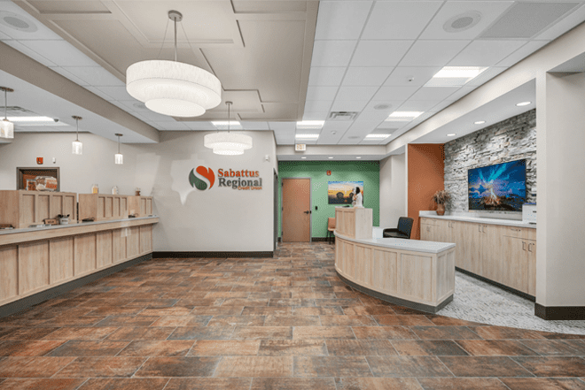
A More Welcoming First Impression
The redesigned branch centers around creating a warm, approachable experience from the moment members walk in. A dedicated reception area provides immediate guidance and a more personal introduction to the space.
Natural textures, soft lighting, and an open layout work together to create an environment that feels both comfortable and modern. Subtle references to the Sabattus landscape are woven throughout, reinforcing a sense of place and connection to the surrounding community. The result is a first impression that feels inviting, familiar, and true to the credit union’s identity.
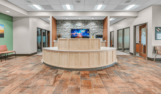
Designed for Better Flow
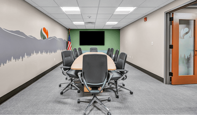
The 8,030 square foot renovation improves both functionality and experience. A four-person teller line supports efficient transactions, while fourteen private offices across two levels allow for more in-depth, one-on-one conversations.
Supporting spaces — including a boardroom, safe deposit area, coin machine, and drive-up ATM — are thoughtfully integrated into a layout designed for clarity and ease of movement. The open plan enhances visibility and flow, creating a branch that feels intuitive, organized, and flexible for both staff and members.
Supporting Staff Experience
Behind the scenes, staff spaces were equally prioritized. Updates include a more comfortable breakroom, improved training areas, and spaces that support collaboration. These enhancements strengthen daily operations while contributing to a better overall member experience.
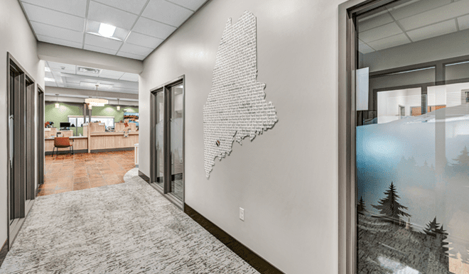
A Brand That Lives in the Space
The updated brand identity comes to life throughout the branch in both subtle and impactful ways. Finishes align with the refreshed color palette, while environmental graphics draw inspiration from Maine’s natural landscape.
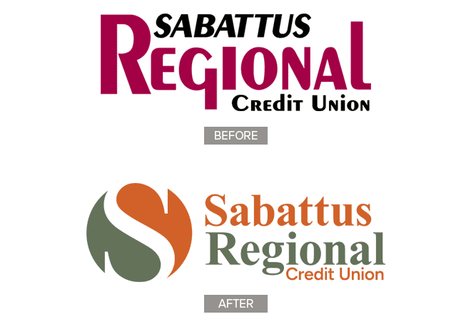
The logo itself was designed with intention and distinction in mind. Avoiding the common shapes used by competitors, we landed on a circle — a form that reflects unity and continuity. A flowing “S” connects the two halves of the circle, symbolizing community coming together in a simple, cohesive mark.
A mural of mountains and trees anchors the boardroom, with similar elements echoed in custom glass banding and details throughout. The new logo and messaging are thoughtfully integrated, creating a consistent, human-centered experience that connects brand and environment.
A Cohesive, Member-Focused Result
This project is more than a visual update — it’s a reflection of what Sabattus Regional CU stands for.
By aligning brand, space, and service, the result is a branch that feels warm, efficient, and personal. A place where members feel comfortable, supported, and recognized — just as they always have, now in an environment that truly reflects it.


