
Following a recent merger with another Maine credit union, Great Falls Federal Credit Union saw an opportunity to redefine its future. While the organization had grown and evolved, its brand no longer reflected who it was or where it was headed.
Known throughout Maine for its personalized service, commitment to members, and family-focused approach, Great Falls wanted its brand to better reflect who they had become—and where they were headed. Their leadership team described the credit union as rural, dedicated, and authentic. They took pride in knowing members by name, going above and beyond to provide exceptional service, and building lasting relationships within their communities.
Yet their existing identity no longer told that story.
The logo felt dated. Brand standards didn’t exist. There was no clearly defined voice, personality, or visual system to guide communications. At the same time, Great Falls was looking to attract younger families while continuing to serve longtime members across generations.
They needed more than a new logo. They needed a brand that reflected their values, inspired employees, and created confidence in the future.
Creating a Brand with Purpose
Working closely with the Great Falls team, we began by uncovering what made the credit union unique. The goal wasn’t simply to modernize their image—it was to create a visual identity rooted in their Maine heritage, community-focused culture, and commitment to personalized service.
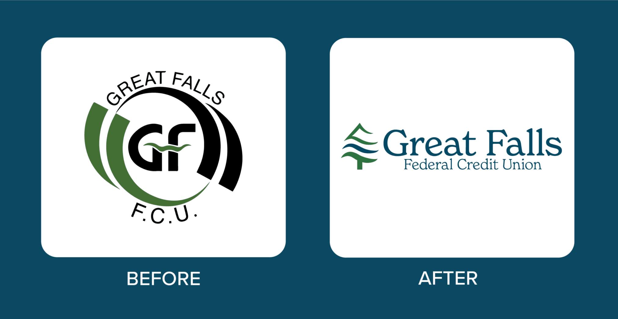
The new logo draws inspiration from two defining elements of the credit union’s story: Maine’s natural landscape and the Great Falls waterfall that inspired its name. A stylized pine tree and flowing wave forms come together to create a mark that symbolizes growth, strength, and resilience while remaining approachable and welcoming.
The result is a logo that balances innovation and tradition—honoring the credit union’s roots while positioning it for the future.
To support the new identity, we developed a comprehensive brand standards system, including color palettes, typography, and visual guidelines that would create consistency across every member touchpoint.
Shades of blue and green were selected as the primary brand colors, reflecting the tranquility, stability, growth, and balance found throughout Maine’s natural environment. Together, they create a calm, trustworthy, and approachable presence while helping Great Falls stand apart from local competitors.
Typography was carefully selected to reinforce that balance between tradition and modernity. The combination of New Spirit and Pragmatica provides both timeless character and contemporary clarity, creating a visual language that feels welcoming to members of all generations.

Extending the Brand Beyond the Logo
The transformation didn’t stop with the visual identity.
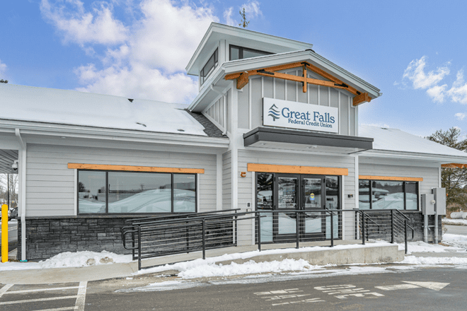
At the same time Great Falls was redefining its brand, the credit union was investing in a new branch experience designed to better serve both members and employees.
Their goal was to create a healthy, modern environment that reflected the organization’s renewed vision while providing the flexibility today’s members expect. The branch needed to support a wide range of services—from everyday transactions and large deposits to account servicing and notary assistance—while maintaining the convenience of drive-up banking.
Just as importantly, Great Falls wanted employees to feel empowered within the space. The new environment was designed to encourage engagement, collaboration, and confidence, creating a workplace employees could take pride in.
The result is a branch experience that balances technology and personal service, offering modern conveniences without losing the human connections that have always defined the credit union.
A New Sense of Pride
The response to the transformation has been overwhelmingly positive.
Employees and board members quickly embraced the new identity, sparking renewed excitement throughout the organization. With a cohesive brand system and a branch environment that reflects their values, team members are proud to share where they work and what Great Falls represents.
“The new logo, along with the updated colors and fonts, has brought a level of consistency and cohesion that we didn’t have before,” said Dustin Wood, Chief Innovation and Development Officer. “It’s not something you notice until you see it in place, and then the aha moment hits. We are really happy we went through this process.”
For Great Falls, the impact extends beyond visual consistency.
“With the brand refresh, it feels like we finally put some missing pieces together,” Wood added. “It gives us the confidence to be a bit more outgoing and more forward-looking.”
That’s the true measure of a successful rebrand — not simply creating a new look, but creating a stronger sense of identity, purpose, and pride for the people who represent the brand every day.